Why Yahoo Finance Sucks
A lot of really useful media outlets start out as great tools for users and then fall into a number of traps that quickly render them not only useless, but annoying beyond measure.
Yahoo Finance is one of those—and from a trader’s perspective, it used to be great. Now, it’s about the last place we go.
I’m not just pissing and moaning here—this is a real beef for many in my trading circle.
So, I’ll offer some constructive criticism and, with any luck, someone who pulls strings at Yahoo Finance will take note and return the outlet to its former glory.
My Yahoo Finance Grievance List:
Download a PDF version of this post.
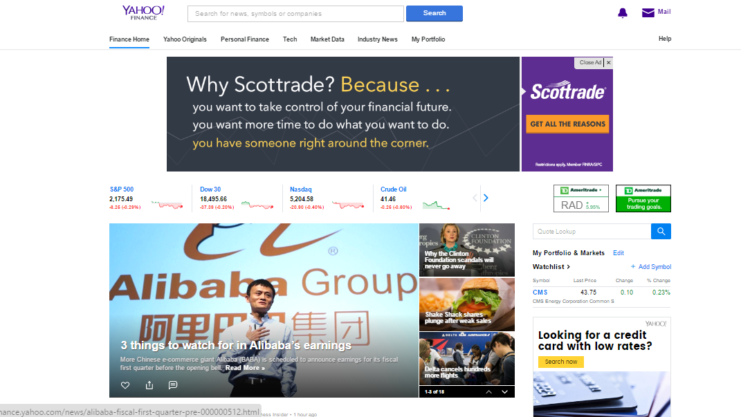
1.) Let’s start with the main page:
This is an advertising purgatory of some sort that inundates you with non-stop clickbait articles and paid ads.
2.) We want Tickers, Not Clickbait
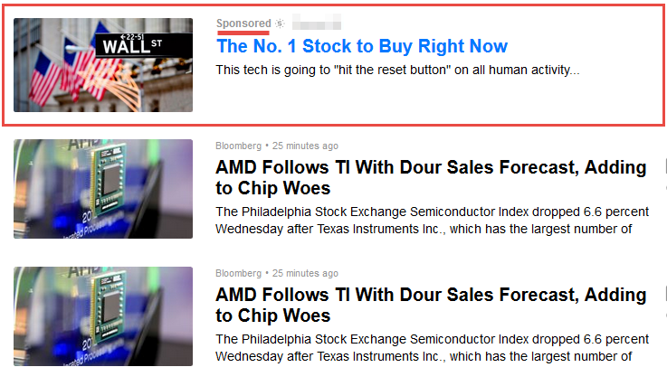
This page makes the tickers highly undesirable. Every time you go to a ticker, the first article is a non-related paid ad and more clickbait.
 In the past, Yahoo Finance offered us ONLY the news related to a specific ticker.
Those days are gone.
Now, there are sponsored links in all of the news feed. And, this is probably my biggest complaint. There is zero purity here.
It’s painfully obvious that they are just gunning for cheesy click revenue.
3.) Logistics
From a logistics perspective, there is also a lot of negative stuff going on here. Most noticeably, the tabbed navigation is mind-numbing slow. The old version gave you lightening-speed navigation, via a sidebar. But, that’s gone now, because the objective is to steer you into the eye of the advertising storm.
4.) The Default Chart Areas are USELESS
For traders, the default area charts are entirely useless.
By the time you have jumped through all of the hoops to get where you need to be, it’s no longer relevant. The required change to candlesticks is also annoying for day traders.
5.) The trader exodus from Yahoo Finance makes it even less relevant.
One of the greatest values of Yahoo Finance (before it decided to focus entirely on clicks) was the sheer number of trader eyeballs looking at it.
They’re gone now; they’ve all moved to other services. With far fewer traders watching, Yahoo Finance becomes much less valuable to the rest of us.
6.) The Gainers List
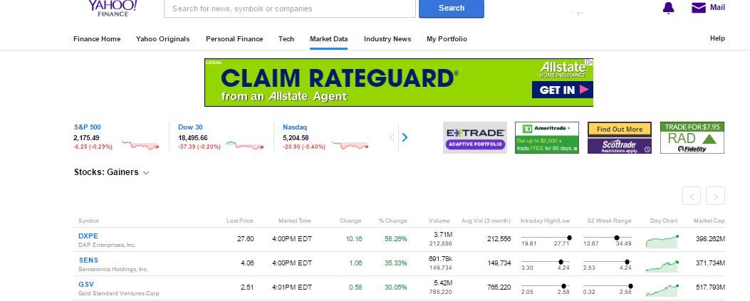
One of the most valuable offerings of Yahoo Finance was always the Gainers List. Unfortunately, this list has had a cosmetic overhaul that is similar to celebrity cosmetic surgeries gone bad.
It’s now brutal on the eyes and hard to read quickly—and speed is the day trader’s key tool. There’s simply too much white space and light coloring. It’s immeasurably harder to read than the older version.
7. The Look and Feel
Finally, the overall “look and feel” is just lacking in every way. One is left with the feeling that a bunch of people sat around a board room and had a single-minded thought: “We get a lot of hits on this page, let’s monetize this crap! Who cares about actual utility of the product?”
I’m not the only one who thinks that the new Yahoo Finance really sucks.
Everyone in my trading circle agrees, as do many other traders out there. Twitter is loaded with comments about the Yahoo Finance overhaul failure:
The new Yahoo Finance sucks. They’ve really managed to kill it.
— Adam Feuerstein (@adamfeuerstein) June 6, 2016
And quite a few who agree with this statement:
Jeffrey Pritchard @AFMBlog Jul 18 – @adamfeuerstein I just noticed it for the first time tonight. Totally jacked up and useless.
Steve-A-Rino @SteveO_in_AZ Jun 6 – @adamfeuerstein Yes Yahoo Finance is now complete crap. Too bad @YahooFinance messed it up. @Yahoo fix this mess @marissamayer
Other reviews have been equally critical, with users noting outright that “The New Version of Yahoo Sucks”:
- “The new Yahoo quote page version is very poorly developed! The old version seen last week was organized compactly and almost all the information was easy to find. This new loose version is hard to read (if there is useful information, you will have to scroll up and down, not compactly organized in a small neat page), not to mention some critical information in the old version is no longer in the new version (such as a company’s sec filing link is not in obvious tab!) I don’t understand why people spent time to develop a new version that is much worse than old version.”
- “The new layout is HORRIBLE! The constant stream of flash advertising was bad enough, but now I have to scroll all over the place to (maybe) find what used to be at the top of the main page (which is now mostly ads). Time to find a new finance site.”
What Traders Want
Quite simply, we want the old Yahoo Finance back, or we’ll just find something else.
We understand Yahoo Finance wants to make money and that’s pretty much it’s only goal. But, it has to strike a balance. Once the remaining traders leave, it won’t be nearly as lucrative for advertisers, as readership plummets.
The advertising bombardment has completely overrun everything here.
What Yahoo Finance needs to understand is that the traders who have long loved this site can’t afford to wade through the bling. The day trader certainly can’t afford it. While we’re trying to get to what we need in the click-flurry, our deals are dead.
So for us, Yahoo Finance is now dead.
While I’d like to give it another chance at reform, I’m not confident it will happen.
Ad revenues tend to blind board rooms, even when they are short-sighted and promise to be fleeting.
If they wait too long, though, someone else will fill in the gap. Other services are already taking the traders …
What I’m wondering is who is watching this widening gap and waiting to step in to take advantage of it. I’m definitely watching.


